
Sherwin Williams Drift of Mist (SW 9166): Complete Paint Color Review
Drift of Mist is the paint color that five homeowners will describe five different ways — a soft gray, a warm off-white, a greige, a barely-there green, and “I can’t quite name it but the room feels right.” That ambiguity is exactly why it works. Sherwin Williams Drift of Mist SW 9166 sits at the intersection of gray, beige, and white, shifting between them depending on the light, the time of day, and the colors surrounding it. In north-facing rooms, it reads as a cool, soft gray.
In south-facing rooms flooded with warm light, it leans creamy and almost white. And in the golden light of late afternoon, a faint green undertone surfaces that most people never notice until they see it next to a true white.
Sherwin Williams Drift of Mist (SW 9166) is a light neutral greige with an LRV of 69, placing it near the off-white range. Its undertones are warm gray with a muted green-greige cast — warm enough to avoid feeling cold, neutral enough to avoid reading beige, and light enough to brighten rooms without washing out to pure white.
Drift of Mist works as a whole-house color, on kitchen cabinets, in bedrooms, on exteriors, and as a versatile neutral that pairs with both warm and cool accent colors. The best trim whites to pair with Drift of Mist are Sherwin Williams Pure White (SW 7005) and Extra White (SW 7006).
This review covers the undertones, LRV, how the color behaves in different lighting, the best rooms to use it in, coordinating colors, comparisons with similar neutrals, and the honest verdict on when Drift of Mist works — and when it doesn’t.
Drift of Mist at a Glance
| Detail | Info |
| Color code | SW 9166 |
| Color family | Neutral / greige |
| LRV (Light Reflectance Value) | 69 |
| Hue family | Yellow (warm gray base) |
| Undertones | Warm gray with muted green-greige cast |
| HEX code | #D9D6CE |
| RGB values | 217, 214, 206 |
| Best trim pairing | SW Pure White (7005) or SW Extra White (7006) |
| Sheen recommendation | Eggshell or satin (walls), semi-gloss (trim), flat/matte (ceilings) |
| Whole-house color? | Yes — one of the best whole-house neutrals in the SW collection |
Undertones: What Makes Drift of Mist Tricky
The undertone of Drift of Mist is a warm gray carrying a muted, low-saturation green-greige cast. It’s not a clean beige. It’s not a cold gray. It’s not an obvious green. The word “muted” is doing serious work — the green undertone is so subtle that most people can’t name it, but they’d notice if it were absent.
The undertone behavior shifts with lighting:
| Lighting Condition | How Drift of Mist Reads |
| North-facing room (cool light) | Cooler, more distinctly gray, faint blue-green cast possible |
| South-facing room (warm light) | Warmer, creamier, almost off-white, green disappears |
| East-facing room (morning light) | Bright and warm in the morning, cooler and grayer by afternoon |
| West-facing room (afternoon light) | Neutral in the morning, warm and golden by evening |
| Artificial warm light (2700K bulbs) | Reads warmer, more beige, the green recedes |
| Artificial cool light (4000K+ bulbs) | Reads cooler, more gray, green undertone can become visible |
| Adjacent to bright white | Drift of Mist will look noticeably warmer and slightly colored |
| Adjacent to warm beige | Drift of Mist will look cooler and grayer by comparison |
This chameleon behavior is both the strength and the trap of Drift of Mist. It adapts to its environment — which means it looks different in every room of your house if the lighting varies. That’s fine for a whole-house neutral (slight variation between rooms adds depth). It’s a problem if you expect identical color from room to room.
The honest test: Buy a sample pot (or peel-and-stick sample). Paint a 2×2-foot swatch on the wall in the room you’re considering. Look at it in morning light, afternoon light, and evening light (with your actual light bulbs on). If it looks right in all 3 conditions, proceed. If it reads too green or too gray in any condition, consider Agreeable Gray (warmer) or City Loft (more beige) instead.
LRV: What 69 Means in Practice
Drift of Mist’s LRV (Light Reflectance Value) of 69 places it near the off-white range — light enough to brighten rooms but dark enough to read as a color rather than a plain white.
For context:
| LRV Range | Category | Example |
| 0–20 | Dark | SW Tricorn Black (LRV 3) |
| 20–40 | Medium-dark | SW Agreeable Gray (LRV 60) falls just above this |
| 40–60 | Medium | SW Mindful Gray (LRV 48) |
| 60–70 | Light | SW Drift of Mist (LRV 69) |
| 70–80 | Off-white | SW City Loft (LRV 70) |
| 80–96 | White | SW Pure White (LRV 84), SW Extra White (LRV 86) |
At LRV 69, Drift of Mist reflects a significant amount of light — enough to make rooms feel brighter, larger, and more open. It’s ideal for rooms that need brightening without going full white. In rooms with abundant natural light, it can wash out and read almost white. In rooms with limited light, it holds its color better and reads as a soft, warm gray.
Best Rooms for Drift of Mist
Living Rooms
Drift of Mist is one of the best living room neutrals in the Sherwin Williams collection. In a living room with natural light, it provides a warm, inviting backdrop that lets furniture, art, and textiles take center stage without competing. The color is neutral enough to work with both warm (leather, wood, brass) and cool (marble, chrome, blue textiles) elements.
Kitchens and Kitchen Cabinets
Drift of Mist works beautifully on kitchen cabinets — especially in kitchens with cool or neutral countertops (white quartz, marble, gray granite) and stainless steel appliances. On cabinets, it reads as a warm off-white that avoids the starkness of a pure white cabinet while still keeping the kitchen bright. Pair with SW Pure White or SW Extra White on trim and crown molding for contrast.
Bedrooms
Bedrooms are where Drift of Mist shines brightest — the warm gray-greige creates a calming, cocoon-like atmosphere without feeling cold or sterile. The color is dark enough to feel like a “real” color on the walls (not just white) but light enough to keep the room feeling airy.
Bathrooms
Drift of Mist works in bathrooms with natural light — the warm undertone prevents the room from feeling clinical. In windowless bathrooms with only artificial light, test the sample carefully — cool LED lighting can pull the green undertone forward.
Exteriors
Drift of Mist has grown in popularity as an exterior color — particularly for home exteriors paired with white trim and dark shutters or a contrasting front door. On exteriors, it reads lighter than on interior walls (outdoor light is more intense). It works best on homes with architectural detail (board and batten, craftsman trim, farmhouse siding) where the subtle color prevents the flatness of a pure white exterior.
Whole-House Color
Drift of Mist is one of the top 5 whole-house paint colors in the Sherwin Williams collection. Its neutrality allows it to flow through hallways, living areas, bedrooms, and bathrooms without clashing. The slight color shift between rooms (warmer in south-facing rooms, cooler in north-facing rooms) adds depth rather than inconsistency.

Coordinating Colors
Drift of Mist pairs well with both warm and cool accent colors — a rare quality among neutrals.
| Color Pairing | SW Color | Effect |
| Trim white | Pure White (SW 7005) | Clean contrast without being stark |
| Trim white (brighter) | Extra White (SW 7006) | Crisper, cooler contrast |
| Accent — navy | Naval (SW 6244) | Classic, high-contrast combination |
| Accent — dark green | Pewter Green (SW 6208) | Pulls out Drift of Mist’s green undertone beautifully |
| Accent — warm blue | Waterloo (SW 9141) | Soft, calming combination |
| Accent — black | Tricorn Black (SW 6258) | Modern, high-contrast trim or doors |
| Accent — warm terracotta | Cavern Clay (SW 7701) | Earthy, warm combination |
| Ceiling white | Ceiling Bright White (SW 7007) or Pure White | Keeps ceilings bright and clean |
| Kitchen island | Iron Ore (SW 7069) or Urbane Bronze (SW 7048) | Two-tone kitchen contrast |
Drift of Mist vs Similar Colors
| Color | Code | LRV | Undertone | Difference from Drift of Mist |
| Drift of Mist | SW 9166 | 69 | Warm gray, muted green-greige | — |
| Agreeable Gray | SW 7029 | 60 | Warm beige-gray (greige) | Darker, warmer, more beige, stronger presence |
| City Loft | SW 7631 | 70 | Warm beige | Similar LRV but noticeably warmer and more beige |
| Repose Gray | SW 7015 | 58 | Cool gray with purple undertone | Cooler, darker, more distinctly gray |
| Gossamer Veil | SW 9165 | 62 | Green-greige (warmer) | Darker, warmer, green undertone more visible |
| Pale Oak (BM OC-20) | BM OC-20 | 69.89 | Warm beige with pink | Similar LRV, warmer, slight pink that Drift of Mist lacks |
| Worldly Gray | SW 7043 | 57 | Green-gray | Darker, more obviously green-gray |
| Alabaster | SW 7008 | 82 | Warm white | Much lighter, reads as a warm white not a greige |
The most common comparison: Drift of Mist vs Agreeable Gray. Agreeable Gray is darker (LRV 60 vs 69), warmer, and reads more distinctly as a greige. Drift of Mist is lighter and more versatile — it can pass as an off-white in bright rooms while Agreeable Gray always reads as a definite color.
Drift of Mist vs Benjamin Moore Pale Oak: Both have an LRV of approximately 69 to 70 and are popular whole-house neutrals. Pale Oak leans warmer with a faint pink undertone. Drift of Mist leans cooler with a green-greige undertone. If your room has warm-toned wood floors and warm lighting, Drift of Mist provides balance. If the room already skews cool, Pale Oak adds warmth.
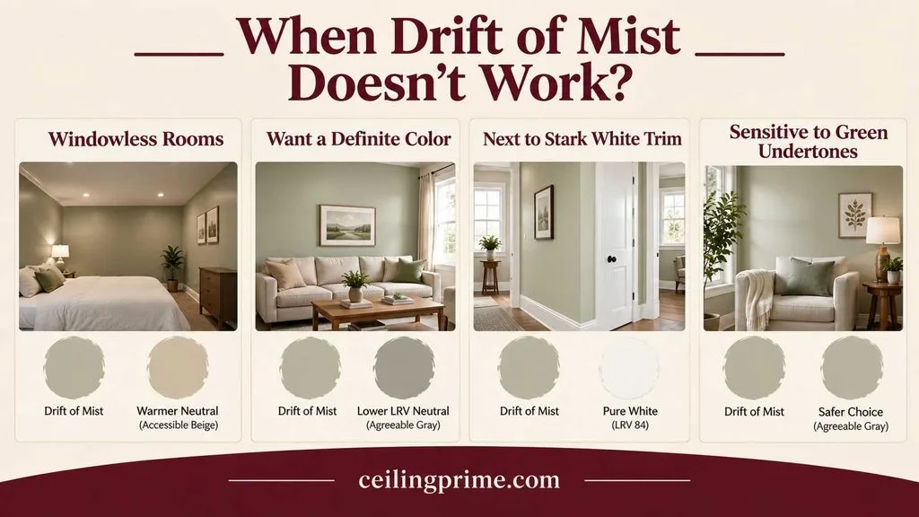
When Drift of Mist Doesn’t Work?
Drift of Mist is not the right color for every situation. Here’s when to choose something else:
- Windowless rooms with cool LED lighting: The green undertone can become visible and read slightly sickly. Switch to a warmer neutral (Accessible Beige, Agreeable Gray).
- Rooms where you want a definite color: At LRV 69, Drift of Mist can wash out in bright rooms and read almost white. If you want the walls to clearly read as a color, choose a lower-LRV neutral (Agreeable Gray at 60, Worldly Gray at 57).
- Next to stark white trim in cool light: The contrast can make Drift of Mist look slightly dirty or yellowed. Pair with Pure White (LRV 84) rather than Extra White (LRV 86) to soften the contrast.
- If you’re sensitive to green undertones: In certain light, the green-greige cast is noticeable. If green undertones bother you, Agreeable Gray or City Loft are safer choices.
How to Sample Drift of Mist Correctly?
- Buy a sample pot or peel-and-stick swatch from Sherwin Williams ($8 for a pint, or order Samplize peel-and-stick samples for $6 each).
- Paint a 2×2-foot swatch on the actual wall — not on white paper or poster board (the surrounding wall color affects perception).
- View in 3 light conditions: morning natural light, afternoon natural light, and evening with your actual room lights on.
- Compare against your trim. Hold a piece of your trim color (or paint a swatch of your intended trim white) next to the Drift of Mist swatch. The combination matters more than either color alone.
- Live with it for 48 hours. First impressions of paint colors are often wrong — your perception adjusts after a day of seeing the color in changing light.

Final Thoughts
Sherwin Williams Drift of Mist SW 9166 is the neutral that does the most while showing the least. At LRV 69, it brightens rooms without disappearing into white. Its warm gray base prevents the coldness of a true gray. Its muted green-greige undertone adds depth without announcing itself. And its ability to shift between warm and cool — reading as creamy in afternoon sun and softly gray in morning shade — makes it one of the most versatile whole-house neutrals Sherwin Williams has ever produced.
The catch is the same as the strength: Drift of Mist changes with the light. In the right conditions, it’s perfect — warm without being beige, gray without being cold, light without being white. In the wrong conditions (cool LED lighting, north-facing rooms with no warmth), the green undertone emerges and the color can read differently than you expected.
Sample it. Live with the swatch for 48 hours. Look at it in the morning, the afternoon, and at night. Compare it against your trim white, your flooring, and your furniture. And if it looks right in all 3 lighting conditions — in the room you’re actually painting — then Drift of Mist is probably the color you’ve been looking for. The one that doesn’t quite have a name. The one that makes the room feel right without you being able to explain exactly why.
Sherwin Williams Drift of Mist: Frequently Asked Questions
What undertone does Drift of Mist have?
Warm gray with a muted green-greige cast. The green undertone is subtle and shifts with lighting — more visible in north-facing rooms and cool artificial light, less visible in warm south-facing rooms. Most people describe Drift of Mist as a “warm gray” or “soft greige” without identifying the green.
Is Drift of Mist warm or cool?
Drift of Mist is warm-leaning neutral. It’s warmer than Repose Gray (which is cool) but cooler than Agreeable Gray (which is distinctly warm). The warmth prevents it from feeling cold on the walls, while the gray base keeps it from reading as beige.
Is Drift of Mist good for the whole house?
Yes — Drift of Mist is one of the best whole-house paint colors available. Its LRV of 69 brightens without washing out, and its neutral undertone flows between rooms without clashing. The slight color shift between rooms (warmer in sun-filled rooms, cooler in shaded rooms) adds visual interest.
What is the best white trim with Drift of Mist?
Sherwin Williams Pure White (SW 7005) is the most recommended trim pairing. It’s warm enough to complement Drift of Mist without creating a stark cold-white contrast. Extra White (SW 7006) works if you want a crisper, brighter trim line.
Is Drift of Mist good for kitchen cabinets?
Yes — Drift of Mist is excellent on kitchen cabinets, especially in kitchens with cool or neutral countertops. It reads as a warm off-white on cabinets — softer than a stark white but bright enough to keep the kitchen feeling clean and open.
What’s the difference between Drift of Mist and Agreeable Gray?
Agreeable Gray (SW 7029) is darker (LRV 60 vs 69), warmer, and reads more distinctly as a greige. Drift of Mist is lighter, more neutral, and can pass as an off-white in bright rooms. Agreeable Gray is better when you want the walls to clearly read as a color. Drift of Mist is better when you want “barely there” neutral warmth.
Does Drift of Mist look green?
In certain conditions, yes — particularly in north-facing rooms and under cool artificial lighting, the green undertone can become visible. In warm light (south-facing rooms, 2700K bulbs), the green is virtually undetectable. Always sample in your actual room before committing.





One Comment